Here's some feedback - note it is all my opinion so take it or not.
You did a good job with the line breaks in his shirt - they provide support bridges, but still look like continuous lines. Very nice.
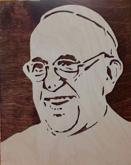
I usually do not try to show the lines between teeth - they tend to look unnatural. Just letting the teeth run together, or maybe some slight bumps at the gum line where the teeth touch, usually looks better.
The eyes look good if they are cuttable - can't see from this image. Eyes are the 1st thing you see in a portrait.
I see you went after the hair treatment. Good job. Hair is always tricky. I usually leave it as produced by the process even though it looks on paper like a head full of slugs. But it is not something a person looks at first in a portrait so the slugs just serve to set the tone of the hair, especially with boys (girls use hair as a major feature and it needs to look right).
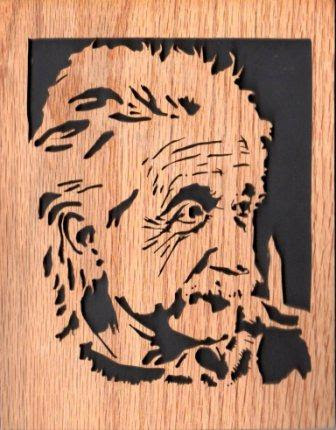
I like the cut-out images with large black background but usually not 180 degrees around the head - I think they look better with 360 degrees around just the face, or 90 degrees around a profile. Steve Good's "Einstein" is a great example of a 90 degree profile - 3/4 image with the face outlined by background but the back of the head merged into the border (I always try for a 3/4 portrait when possible - it seems to render better and is more recognizable). With the 180 degree background I think you will need a frame to define the portrait. Or you might leave a 1/2" wide border around the black background.
I like to add some text to the cutting - maybe a child's name or nick name - to help people recognize who it is. As good as a portrait looks, a lot of people might nit be able to recognize who it is (maybe dyslexic? always surprises me but it happens)
I also tend to concentrate on the face and eliminate below the neck as much as possible.

